Two letters, drawn by hand — a wordmark you can’t reproduce by typing the typeface.
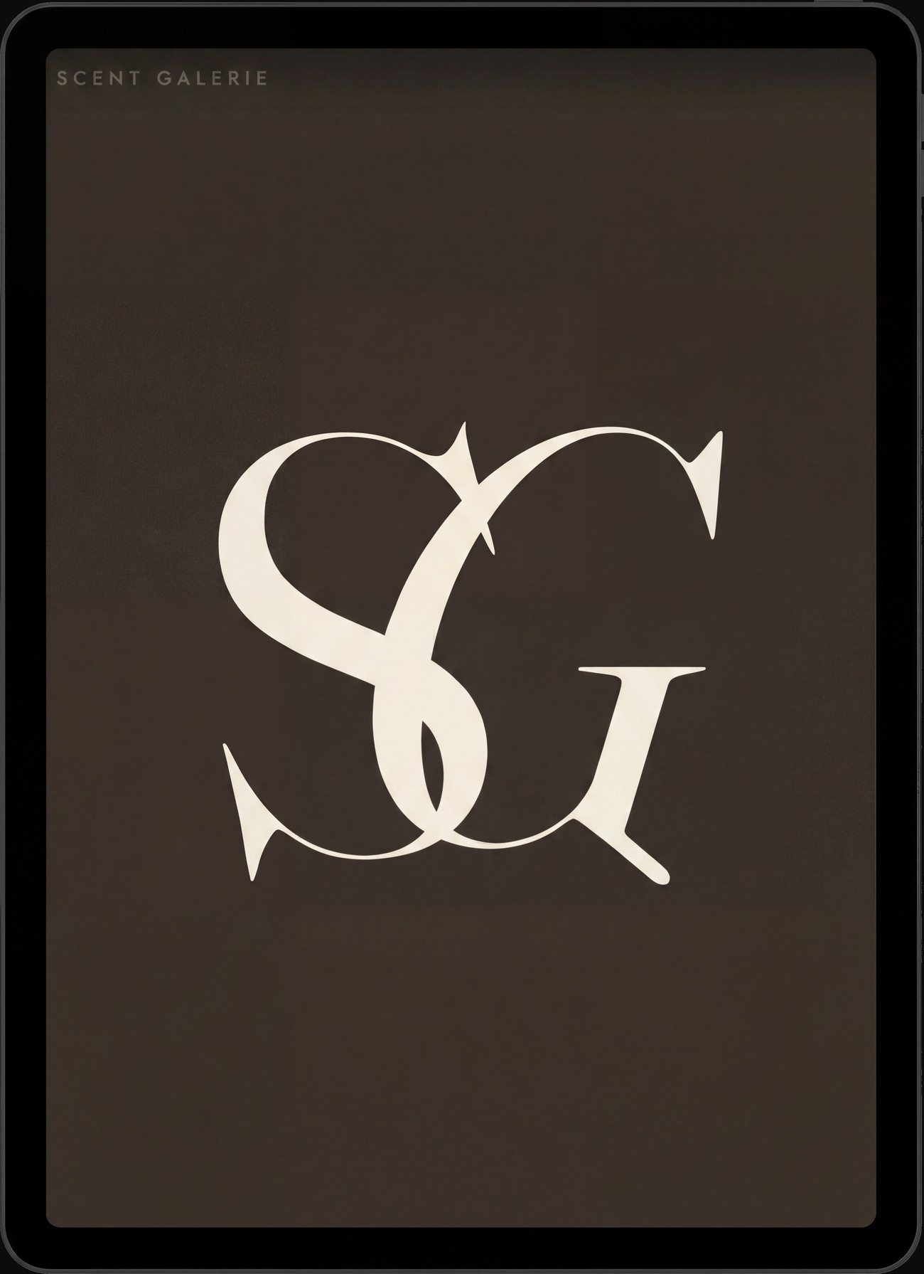
The whole brand lives in two letters. The S and the G are drawn by hand — the sharp flared spurs, the tapered tail of the G — set over Fraunces and then redrawn until the terminals were mine, not the typeface’s. Type the font and you get a different, lesser mark: the character is in the drawing, not the keyboard. That one authored gesture is the thing a competitor can’t lift.
An intertwined SG, built from those same hand-drawn letters — the S nested in the bowl of the G, the G’s tail catching it from below. One compressed signature for the packaging seal, the decanter sticker, the thank-you card and the 16px favicon. Remove the custom letters and it collapses to a stock face.
Behind the letters, the position: an art gallery for fragrance discovery, not a perfume retailer — curated samples and discovery sets, so people find their signature scent before committing to a full bottle. The mark had to feel like curation, the quiet of a gallery wall: premium through restraint, never loud.
Around it, a complete identity — primary, horizontal and all-caps lockups, reverse, social and a guidelines book, every logo delivered as outlines. Warm neutrals (oat, sand, clay, espresso) with one quiet sage, paired with Jost for text and interface. Scandinavian-minimal, gallery-calm, premium without the gold.