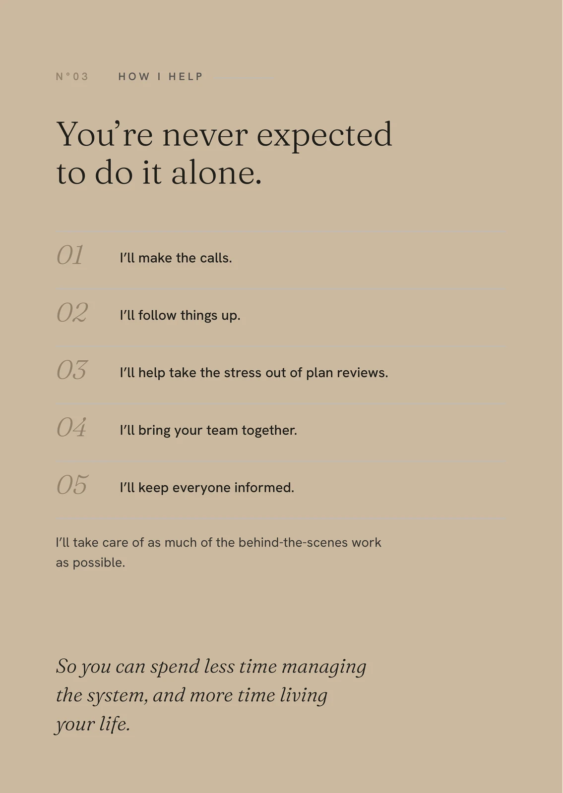
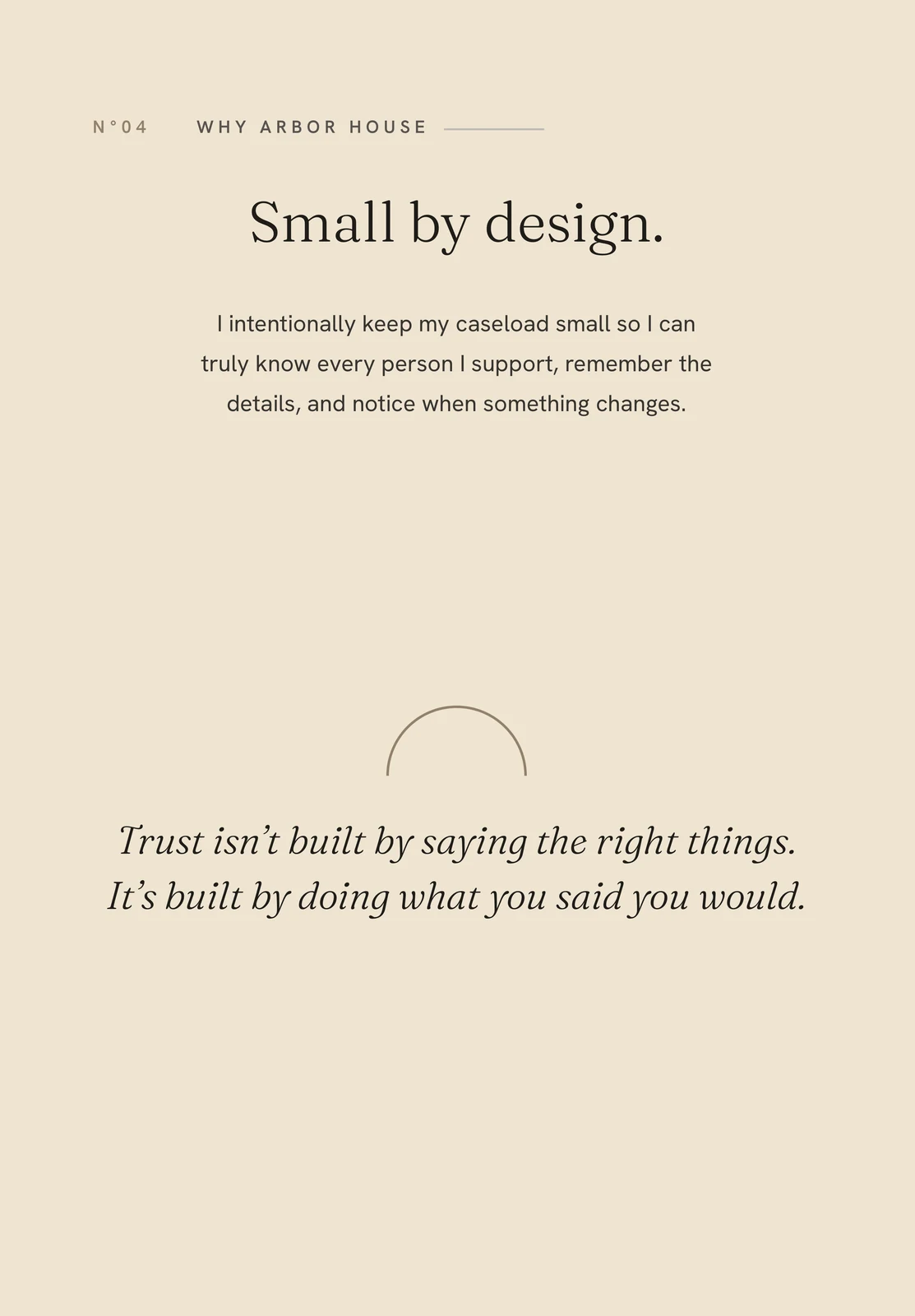
An open arch for a practice that starts with the person — the mark, the six-page site and the print, drawn end to end.
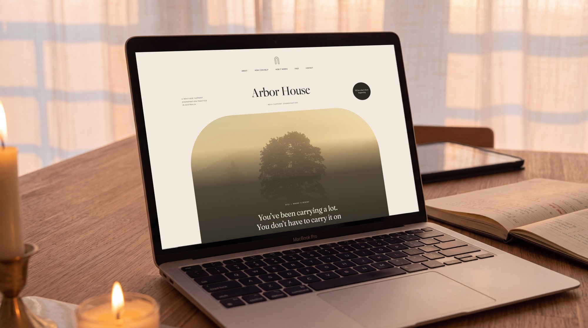
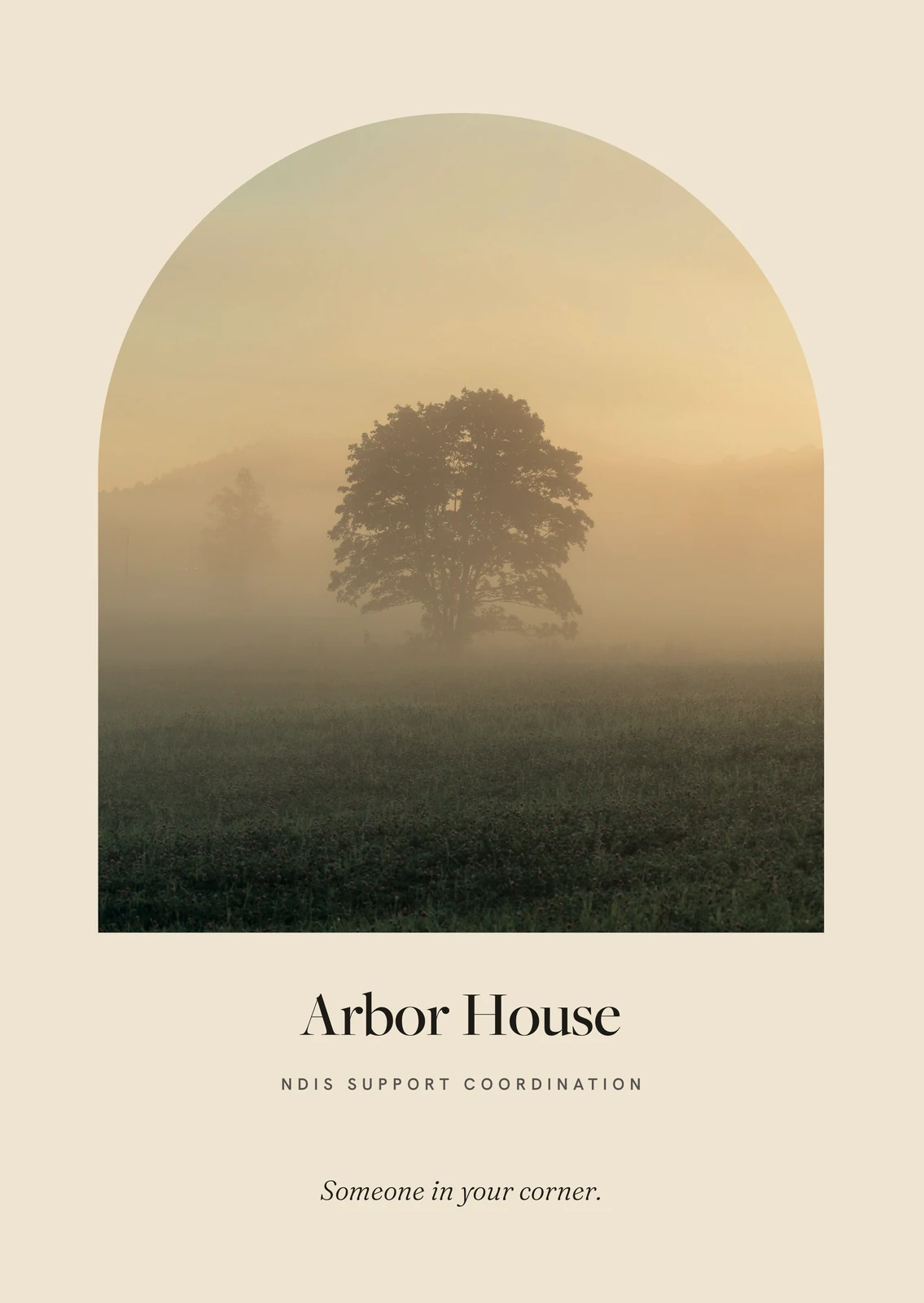
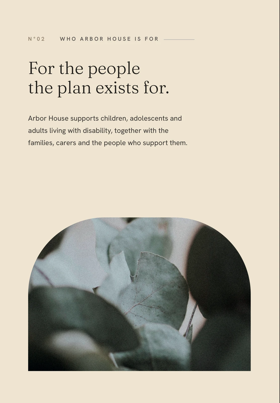
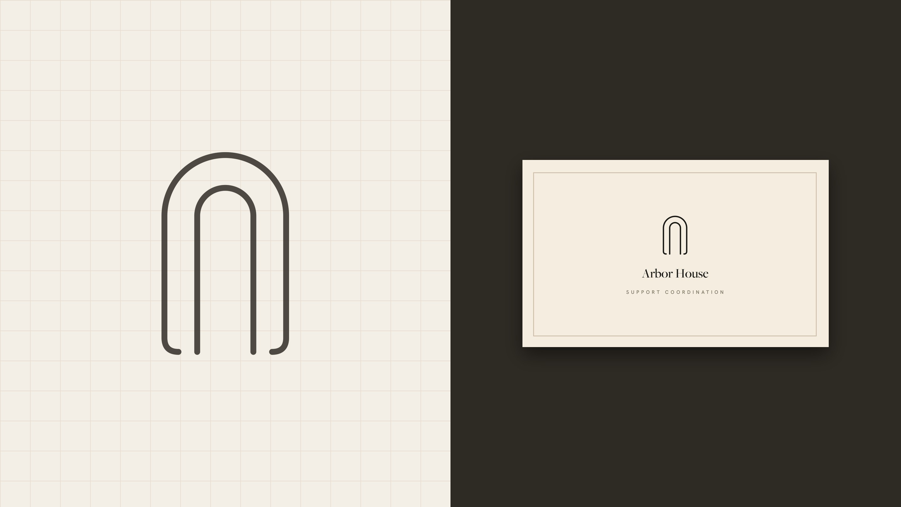
The mark is an open arch, drawn in one even stroke: a doorway, a shelter and an initial at once. The rest of the identity passes through it. Photographs are cropped into arches, the homepage opens through one onto a tree in golden mist, and the brochure cover looks through the same opening in print.
Arbor House is a support coordination practice kept small on purpose, so every person is known and noticed. Every headline on the site and in print is the founder’s own sentence, edited for rhythm and never replaced. The brand sounds like the person a family will actually meet.
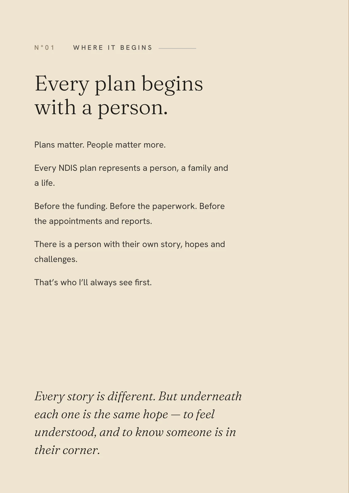
Six pages on Squarespace under a custom CSS layer, numbered like the chapters of a quiet book, with charcoal interludes for the heaviest sentences. Checked on desktop, tablet and phone after every content change. It is live, and it is better seen than described.
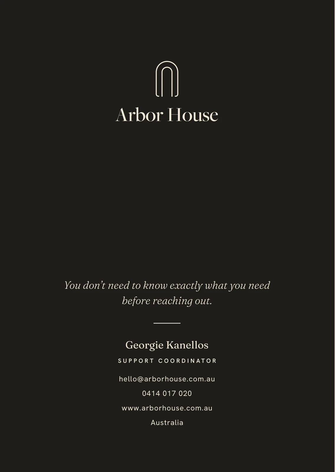
An A5 roll-fold brochure on a single 444 mm sheet, a business card, letterhead and email signatures. The brochure was proofed against a folded dummy, so the chapters read 01 to 04 in the order the hand opens them.
Someone in your corner.